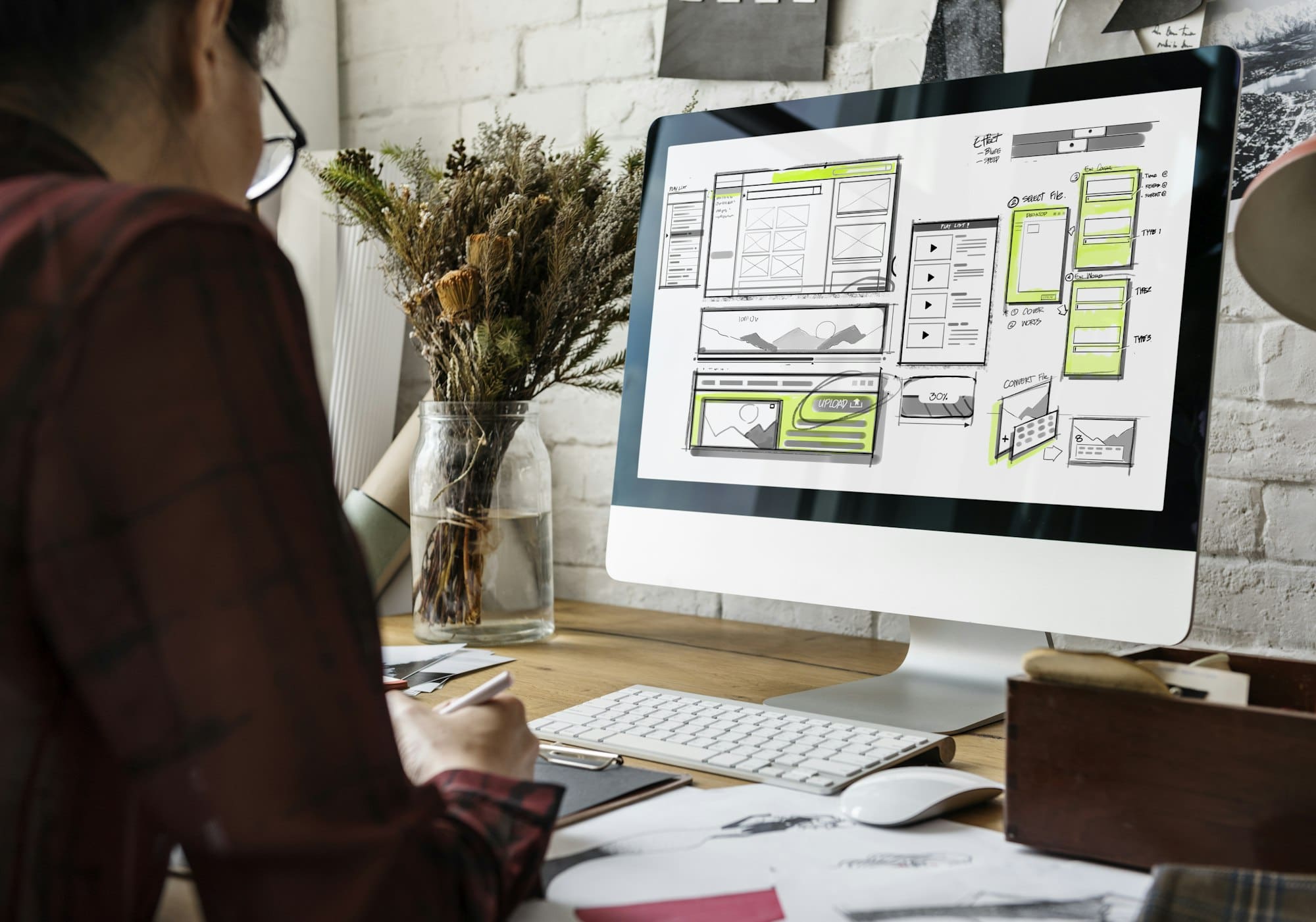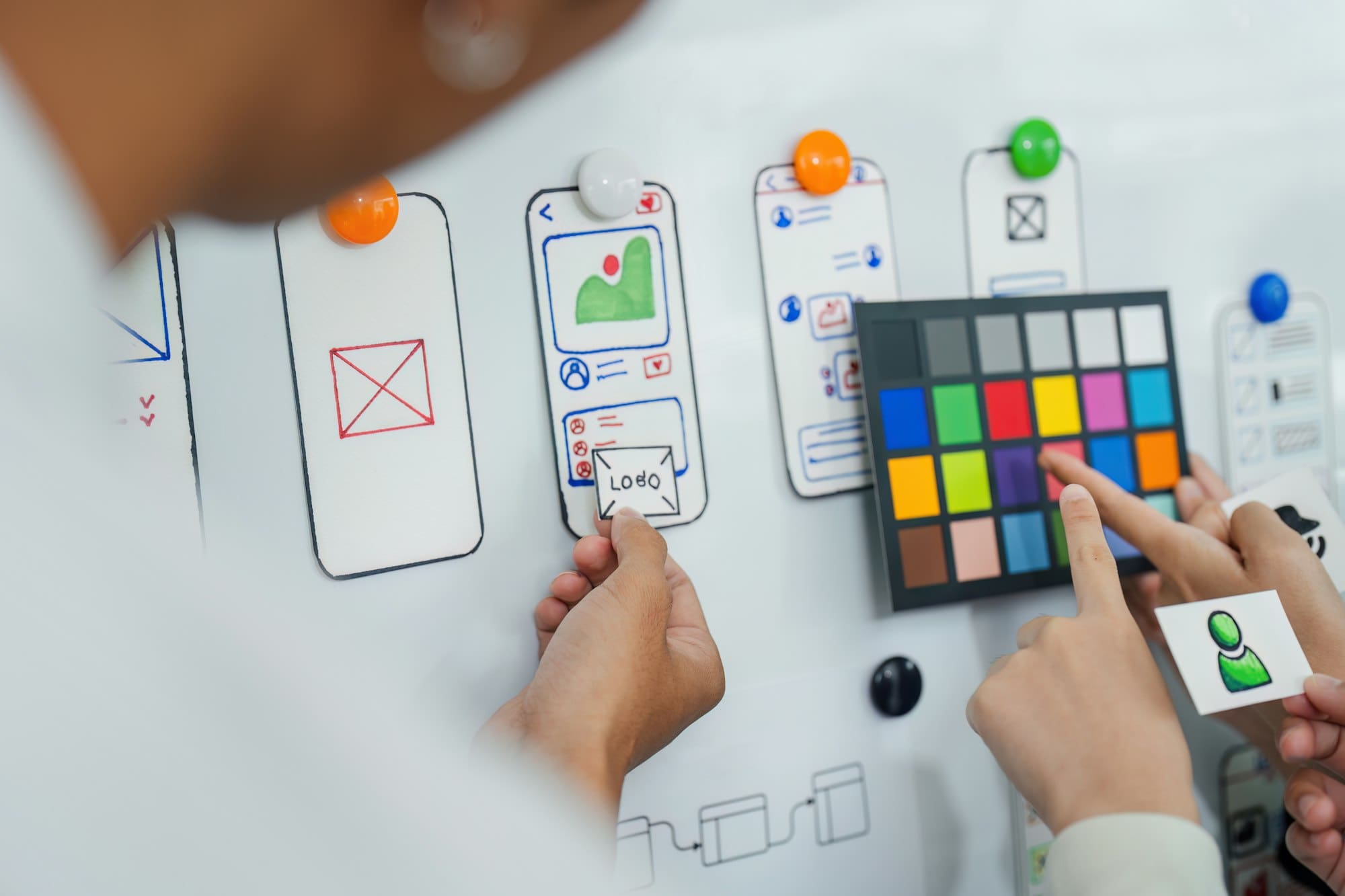
When it comes to UX/UI design, striking the perfect balance between aesthetics and functionality is both a science and an art.
This delicate equilibrium defines how users interact with your product and can make or break their experience. You might create a visually stunning interface, but if it’s not user-friendly, your design efforts could be in vain.
Conversely, a highly functional interface that lacks visual appeal might fail to engage users effectively.
So, how do you achieve this balance? Here are a few principles to guide you:

Achieving a balance between aesthetics and functionality in UX/UI design is pivotal. Stunning visuals might grab a user’s attention initially, but intuitive usability keeps them engaged.
If a design leans too heavily on aesthetics, it might look impressive but leave users frustrated due to its complexity or inefficiency.
Conversely, a purely functional design might be easy to navigate but fail to create a lasting impression or brand connection.
Consider the classic case of minimalistic design. When executed well, it can enhance usability by removing unnecessary clutter and focusing on essential functionalities. However, without thoughtfully infused visual elements, minimalism can appear bland and uninspiring. Thus, the challenge is in seamlessly integrating beauty with usability.
Think of successful tech giants like Apple. Their products are revered not just for their cutting-edge technology but also for their sleek, user-friendly design. This demonstrates how a harmonious approach to aesthetics and functionality can elevate an entire brand’s user experience.
In a world where user expectations are continually evolving, striking this balance is not just a goal but a necessity. Good UX/UI design should inspire, engage, and simplify, all at once.
While functionality ensures that your product performs its intended tasks, aesthetics play a crucial role in how users perceive and interact with it.
A visually appealing design can create a positive first impression, which is vital in retaining users and encouraging them to explore your product further. Think of your design as the storefront of a shop; an attractive display invites people in.

Moreover, aesthetics go beyond just attracting users. They enhance the user experience by making interactions more enjoyable. Elements like color schemes, typography, and imagery can evoke emotions and set the mood, which significantly influences how users feel while using your product. A well-thought-out design can make your product seem more reliable, professional, and easier to use.
Studies have shown that aesthetically pleasing designs not only enhance usability but also create a perception of higher quality and trustworthiness. Users tend to forgive minor usability issues if the overall design is visually satisfying. This psychological effect, known as the “halo effect,” can help in building a strong, positive relationship between your brand and your users.
In summary, aesthetics matter because they do more than make your product look good—they substantially influence:
By carefully choosing and combining visual elements, you can create a user experience that is both functional and delightful.
Functionality is what makes your design usable. It’s the part of UX that ensures users can achieve their goals with ease and efficiency. Essentially, without a focus on functionality, even the most beautiful designs will fail to serve their purpose.
Imagine a stunningly designed website that takes ages to load or features broken links. Despite its aesthetic appeal, users will quickly become frustrated and likely abandon the site. Functionality involves everything from navigation and speed to overall responsiveness.
It’s about crafting a seamless experience where everything works as intended, down to the tiniest detail.
Good functionality enhances the user’s journey by providing intuitive pathways and logical flows. Think of it as the structure supporting your aesthetic choices. An attractive button design is great, but it becomes useless if the button doesn’t work or lead to the desired action.
Consider accessibility as well. Designing with functionality means ensuring your product can be used by people with diverse abilities.
This might involve implementing keyboard navigability, screen reader compatibility, or simple color contrasts for text readability. By prioritizing functional design, you create inclusive and empowering user experiences.
In summary, functionality is the foundation of good UX design. By focusing on usability, efficiency, and accessibility, you lay the groundwork for a design that doesn’t just look good, but works exceptionally well.
Imagine using an app that looks stunning but functions poorly—it’s incredibly frustrating, right? That’s why user-centered design (UCD) is crucial.

At its core, UCD focuses on the needs, wants, and limitations of end-users at every stage of the design process. Instead of guessing what users might like, you involve them directly, ensuring their voices are heard and their needs met.
In UCD, empathizing with your users isn’t optional; it’s fundamental. This involves understanding their pain points, preferences, and behaviors. By stepping into their shoes, you can create more intuitive and satisfying experiences. Techniques like user interviews, personas, and empathy maps are invaluable tools for this.
One of the cornerstones of UCD is iteration. This means designing, testing, and refining your app or website based on user feedback. By involving users in the testing phase, you gain invaluable insights that can be used to tweak and improve the design. This iterative process ensures that the final product is both beautiful and functional.
Usability testing is a critical component that provides real-world insights. By watching users interact with your design, you can identify areas where they struggle or become frustrated. This hands-on approach helps you pinpoint exactly what needs to be improved, guaranteeing a better user experience.
Ultimately, putting people first in your design process leads to products that are not only user-friendly but also delightful to use. It’s about striking a balance between meeting user needs and exceeding their expectations.
As you refine your design, remember that beauty and functionality aren’t mutually exclusive—they’re partners working together to create extraordinary user experiences.

When striving to strike the perfect balance between aesthetics and functionality in UX/UI design, employing the right tools and resources can make all the difference. Here are some essentials that can help you achieve design harmony:
InVision: This tool helps transform static designs into interactive prototypes. By simulating real user interactions, InVision allows you to test the usability early in the design process, making it easier to identify and fix issues.
Axure: Known for its capability to handle complex prototypes, Axure is ideal for designing detailed workflows and data-driven applications. It offers advanced interactions and dynamic content to mimic real-world user experiences.
Maze: A rapid testing tool that integrates with your design software. Maze enables you to get user feedback quickly, helping you make data-driven decisions to refine your designs.
UsabilityHub: This platform lets you run quick and simple tests to gather feedback on your UI elements. With tools like the five-second test and preference test, you can validate your design choices and ensure they resonate with users.
Storybook: A UI component explorer for frontend developers, Storybook allows you to build, test, and share UI components independently. This fosters a consistent user interface and enhances reusability.
Material Design: Google’s design system provides comprehensive guidelines and components for creating visually appealing and functional interfaces. Using Material Design ensures that your products are both aesthetically pleasing and user-friendly.
By leveraging these tools and resources, you can create a balanced UX/UI design that seamlessly integrates aesthetics with functionality, ultimately leading to a user experience that is both delightful and effective.
It’s a common dilemma. Start by understanding your users and their needs. For example, if you’re designing a medical app, functionality might take precedence. However, an e-commerce site benefits significantly from appealing visuals that attract and engage users. Balance can be achieved by user-centered design and iterative testing, ensuring neither aspect overshadows the other.
Absolutely! Accessibility to various free or affordable prototyping tools, design systems, and usability testing methods makes it easier than ever. It’s about making smart choices and focusing on critical areas. Prioritize the elements that provide the most value to users and iteratively improve based on feedback.
One of the main pitfalls is focusing too heavily on one element at the expense of the other. This can lead to visually stunning designs that are a nightmare to navigate, or highly functional interfaces that fail to engage users. Avoid this by ensuring collaboration and feedback loops between designers and developers, and always keep user experience as the focal point.
Striking the perfect balance between aesthetics and functionality in UX/UI design is more than just a goal—it’s a necessity. By focusing on what users need and iterating based on their feedback, you can create designs that are both beautiful and highly functional.
Remember, your design should not only look good but also serve its purpose efficiently, making users’ lives easier and more enjoyable.
Leverage the plethora of tools and resources available to achieve this harmony. Use prototyping tools to visualize your ideas early on, engage in regular usability testing to gather genuine user feedback, and maintain consistency with design systems and style guides.
In conclusion, a user-first approach, coupled with a commitment to continuous improvement, will guide you in constructing seamless and appealing user experiences.
Keep learning, stay curious, and always aim to improve—doing so will not only enhance your projects but also elevate your skills as a designer. Know more resources at Mindhyv


